Allison Bayro
Allison Bayro
Basic Information about Student (Small Background introduction)
Year: Senior Undergraduate Bioengineering Student
Area of Research: Wearable Technology–specifically, tracking tongue and lip movements to develop a method to distinguish different phonemes in silent communication.
Contact Information: abayro2@uic.edu or https://www.linkedin.com/in/allison-bayro/
During this week in the Ob/Gyn department, my team and I focused on observations and interviews in the clinical environment. We were tasked to take an event observed last week and map it out step-by-step using a “storyboard” technique. In doing so, we were able to break from a process into its components and label different pain points. These pain points include steps that may contribute to discomfort, frustration, significant loss of time, and, of course, pain. Given how frequent ultrasounds are done in women’s health, I decided to storyboard its procedure:
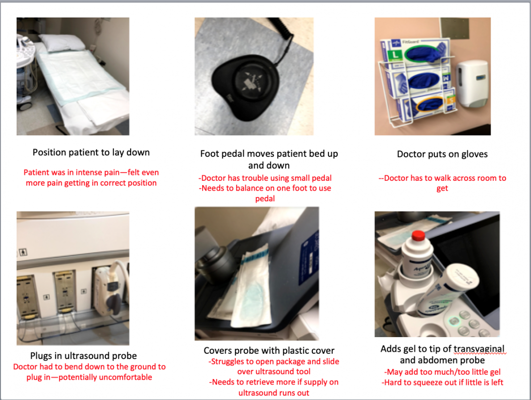
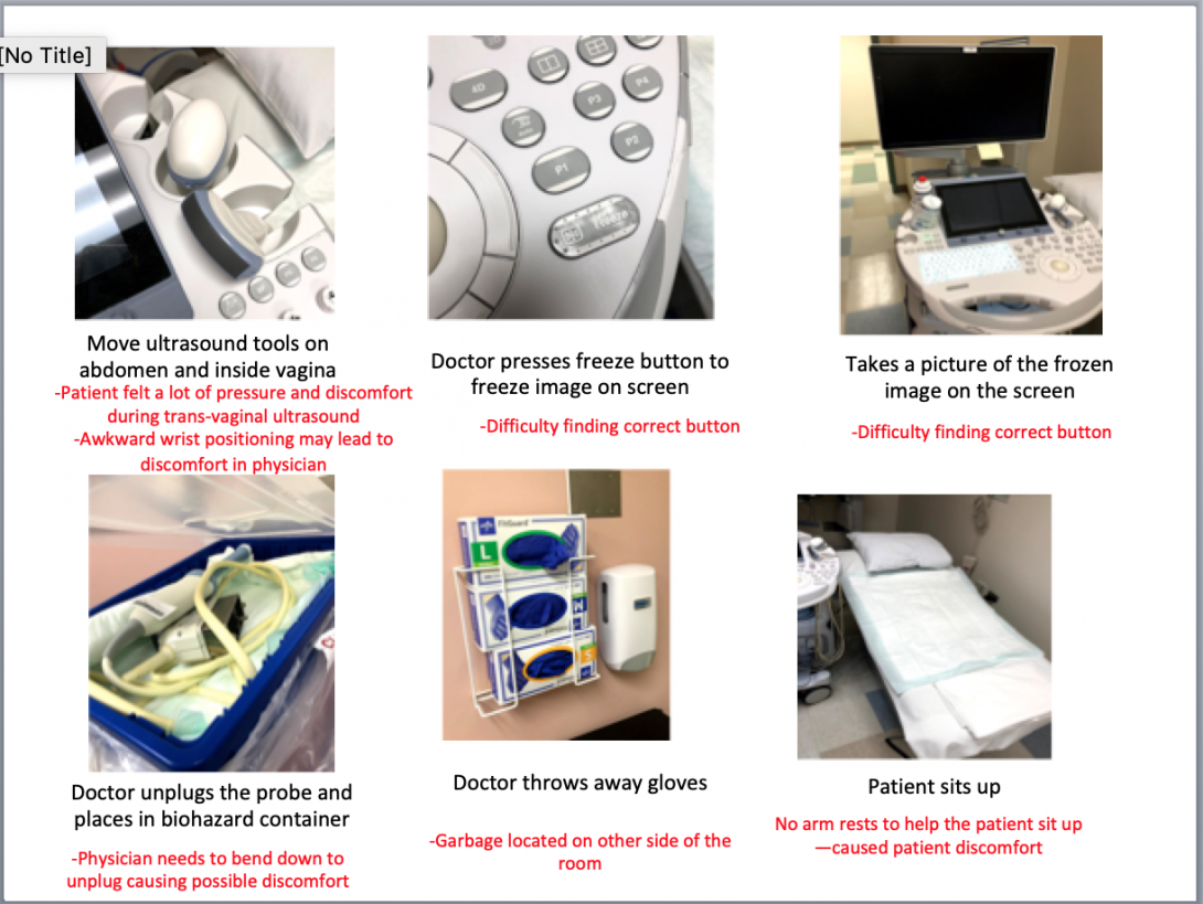
I was able to identify various pain points during the procedure, which caused the patient and physician to feel potential discomfort and pain. The initial patient positioning and final sitting up seemed to be common pain points among various other procedures. For example, my team also created a storyboard for a pap smear and noted similar points of struggle.
My team and I continued to make observations of the clinic, OB ER, and high-risk center. We were able to view new procedures such as a colposcopy, ultrasound, and loop electrosurgical excision procedure. We also had the opportunity to interview other physicians and medical students about their experiences in using specific instruments during procedures. For example, during an interview with an ob/gyn resident, she explained to my team and me the positive and negative experiences she has using the microscope in a colposcopy procedure. Because this interview was in context, she was able to show us the visual difficulties and obstacles. Through follow-up questions, we were able to determine that the primary obstruction of the microscope was the freedom of movement.
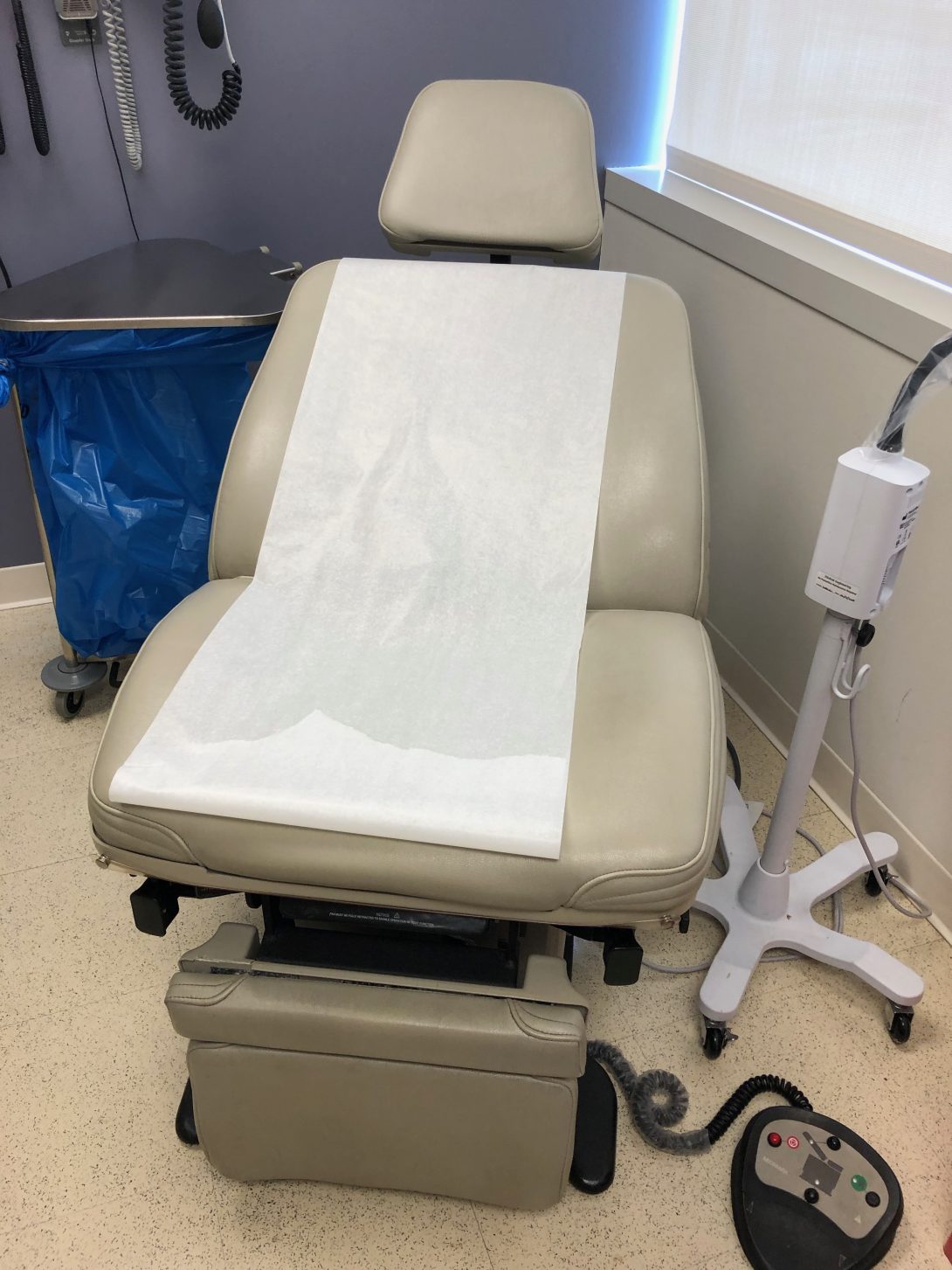
This past week was the first week of the Clinical Immersion Program. In such, my team and I shadowed Dr. Ramanathan in the Ob/Gyn department of UI Health. On Tuesday and Wednesday, we started in the clinic, where we observed several common procedures. Through the AEIOU framework, we took note of different activities, environments, interactions, objects, and users. In such, we used this tool to focus our attention on the search for good and bad designs. The environment of the clinic rooms was very organized and patient-friendly. The tools the physician needed to use were in easily accessible places, and the visits were quick and efficient. There were, however, some bad designs within the clinic. All of the rooms had patient examination chairs without armrests. The controls of the chairs were on the floor and lacked ease of use, as the buttons were poorly labeled. The physician had to press several different buttons before gaining an understanding of how to position the chair properly. Also, several pregnant patients needed to be assisted in sitting up as the examination chair had no handles. This appeared to be a poor design and discomfort for many patients.
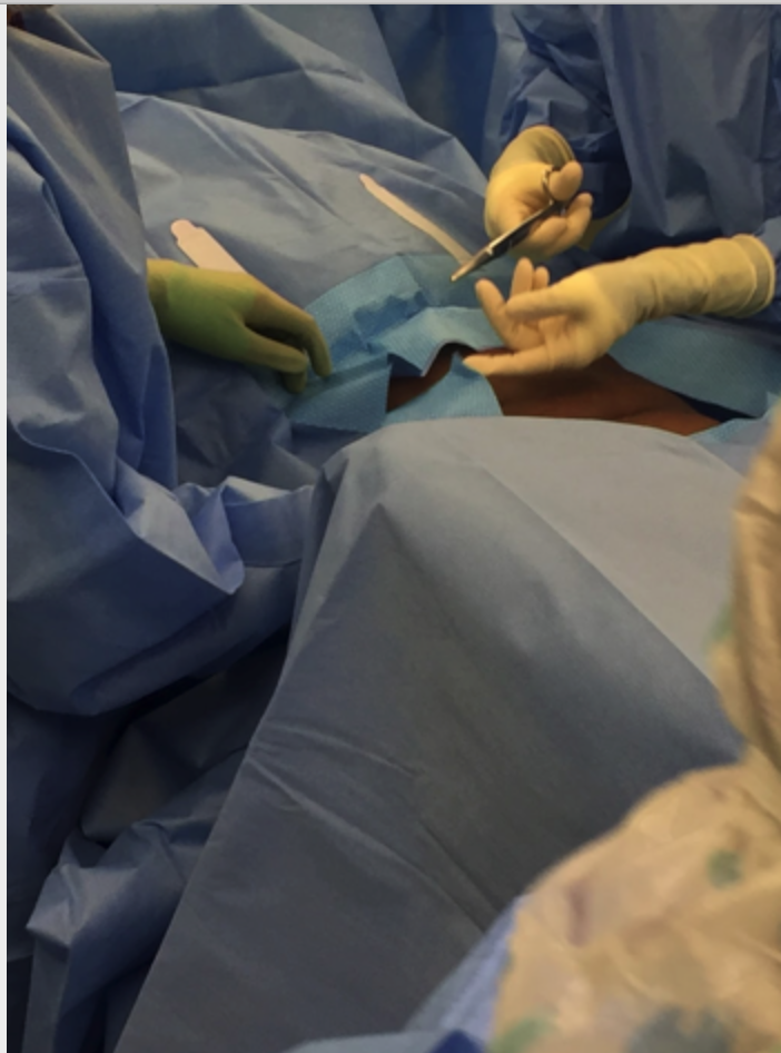
On Thursday, our team met in the OR and viewed several different procedures, including a hysterectomy and myomectomy. I walked into the operating room during the last half of the hysterectomy procedure and immediately noticed several tools and blood on the floor. Furthermore, the cover on the overhead light handle was falling off directly over the patient. During the myomectomy procedure, the drapes were suboptimal in that the opening was vertical and did not fully expose the horizontal surgical site on the abdomen. In such, Dr. Ramanathan needed to cut the drapes to suit the surgery better. In doing so, the adhesive on the drapes did not correctly stick to the patient allowing tools to fall through, which was a poor design.
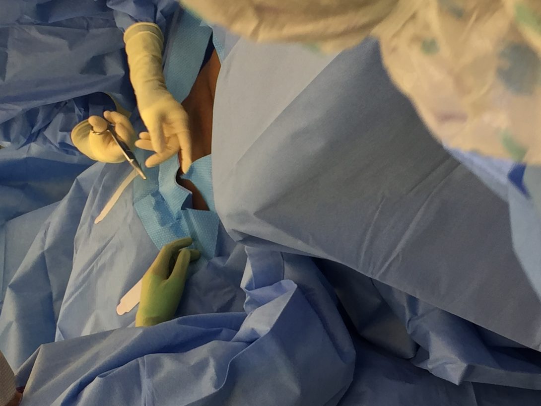
Our group considered the idea of designing a “one-size-fits-all” adjustable surgical drape that considered the type of surgery and size of the patient as well as maintained its proper adhesive function. Also, the nature of this procedure made the operation very bloody. While suction was used throughout the entire procedure, there was a lot of blood on the floor surrounding the surgeons. In fact, this became a slipping hazard. As a workaround, the surgeons used a patient blanket as a floor mat to stand on to avoid slipping.
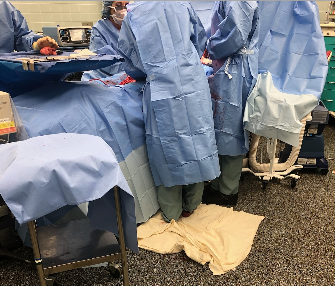
This activity provoked thought within our team of designing a gutter-like system to control blood spill. We also inquired how this design would potentially improve the estimated blood loss during procedures.
Our team noticed several good designs in the OR, including the operation table with many detachable components allowing for proper patient position, and lifted wall outlets causing less tangled wires on the floor.
This week in the OB/Gyn department was one for the books! I had the privilege to see not one, but two births, during my observation in Labor and Delivery. It was a moment I was looking most forward to since I initially heard of my placement in the OB/Gyn department. During the first vaginal delivery, I nearly forgot to note my observations as I was so amazed by the beauty of life. Fortunately, I had another chance to use the AEIOU framework as well as notice good/bad designs in the second c-section delivery.
Some key observations I noticed during the procedure:
- The device used to monitor the heart rate of the patient had a cord that was plugged into a nearby computer station. This cord reached from the operating table, across the walking pathway next to the table, and into the computer. In doing so, the staff in the operating room unplugged and replugged the cord every time he/she wanted to walk through the pathway. I noted this action 12 times. It seemed like an INCREDIBLY, awkwardly placed cord.
- The patient needed a second epidural for the procedure. In such, she was situated in a sitting position with easy access to the lower spine. Due to her previous epidural, the patient struggled to hold herself upright. She slouched, which caused a limitation in the location where the epidural needed to be injected. Four individuals needed to help prop the patient in the correct position. In all, the epidural took 16 minutes.
- The drapes for the procedure had a tubing system. The tubes were used for suction purposes. This was the first procedure I have seen with a built-in system to help with estimated blood loss. In speaking with Dr. Ramanathan about why this procedure, in particular, has the tubes, but other procedures we have seen thus far do not, she said the blood loss in c-sections is a lot more significant in quantity.
- The surgical incision was very small compared to the exposed area of the drapes. In previous surgeries, I noticed that the surgeons needed to make the area larger by cutting the drapes. However, in this case, the area was too large.
The idea that the surgical drapes did not fit the size of the incision seems to be an ongoing issue among the past three weeks. Because of this, my team decided to form our needs statement based on the issue of the subpar exposed surgical area in the drapes.
Our first need state was the following (Problem, Population, Outcome) :
A way to address draping in patients during surgery that provides ideal surgical area
Upon reflecting on this needs statement, my team realized that we did not specify what is what wrong the drapes that cause an issue. Also, we felt that the phrase “ideal surgical area” was incredibly broad. We needed to describe what the term “ideal” meant in the context of the surgery to provide a better description of the outcome of the problem. These thoughts led us to our second iteration of the needs statement:
A way to address the need to cut surgical drapes to better expose the incision area for patients in surgery that do not minimize the adhesive property of the drape against the patient’s skin in cutting the drape.
We initially felt that this needs statement provided much more detailed information on the problem and outcome. However, the needs statement was still very broad with respect to our patient population. We pondered the question: What defines our patient population that causes need? Also, we rationalized that cutting the surgical drapes had other implications other than better exposing the incision area. This led us to our final needs statement:
A way to minimize the loss of time and adhesive properties that results from the cutting of standard-sized surgical drapes to fit an incision area in patients of different stature during various gynecological surgical procedures.
Another exciting week in the OB/Gyn department! I was able to witness another birth, which was just as mesmerizing as the first. I truly enjoy the experiences that CIP has been able to offer thus far!
During the second week of this internship, my team and I met an approximately 20-week pregnant patient who was deaf. She reached out to Dr. Ramanathan to ask how she could interact with the fetal heart rate during the appointment, as she could not hear it. When Dr. Ramanathan told us about this opportunity, we used our critical thinking and bioengineering skill set to formulate an immediate solution. As the appointment to see this patient was scheduled for a couple of days later, we worked on creating an app that would visually and tangibly show the baby’s heartbeat. The app did this by allowing the user to input a fetal heart rate, and then a heart on the screen beat and the phone vibrated to this specific heart rate. We received such positive feedback that we decided to seek more information on prenatal support for deaf individuals. During our chance to interview the deaf patient and through secondary research, we found that there are very little education and technologies available to support deaf pregnant patients. Being said, my team decided that there is an evident need in this area of obstetrics. We created a new needs statement based on this finding:
A method to improve the interaction between the fetus and deaf pregnant individuals that increases maternal involvement in the prenatal experience.
Our initial app idea gave my team and I a great starting point to formulate design criteria and product requirement definitions (PRD) for our prototype. Our current design that allows for deaf pregnant individuals to interact with fetal heart rate consists of two devices connected via Bluetooth. The following are design criteria and PRD’s for the first device:
Part 1 Criteria: Microcontroller & Sound Sensor
- A hand-held device that the user holds
- A clip-on device to doppler that captures sound
- Uses Bluetooth technology to link the two devices
- Cost-effective
- Intuitive -easy on/off switch
- Easy-storage
- Easily Replaceable Battery – Battery Operated
- Visual Heart Rate (depending on device)
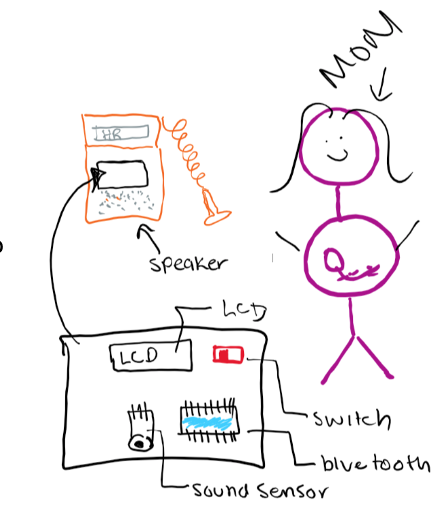
The following image was hand-drawn to show the criteria for the first part of the device, which clips on to the fetal Doppler to capture heart sounds. To further explore the specifications of this device, we populated quantitative, highly technical requirements:
Part 1 PRDs: Microcontroller & Sound Sensor
- External volume shall be 2.5”x3”x3”
- Housing shall be constructed of PLA and insulating Styrofoam that encompasses all parts besides the sound sensor
- Weight shall be under 2lb
- PLA housing shall attach to doppler around speaker via 2”x1” stick-on plastic velcro
- Bluetooth transmitter within circuitry shall transmit information to Part 2 receiver, which shall remain less than 10’ away
- On/off switch shall be located on the external portion of the housing, shall be 0.5”x0.25”, binary, colored red, labeled, and associated with an LED to signal switch status.
- Can fit in a 5”x5”x5” storage container
- Device shall be operated by a rechargeable 5V battery pack
As previously mentioned, our device will have two parts. The first part will be directly connected to the Doppler to capture sounds, while the second will be held by the patient to visually and tangibly feel the captured heart sounds. The following are our criteria and PRDs for the second part of the device:
Part 2 Criteria: Led & Vibration
- A hand-held device that the user holds
- Uses Bluetooth technology to link the two devices
- Friendly appearance
- Cost-effective
- Intuitive -easy on/off switch
- Easy-storage
- Easily Replaceable Battery – Battery Operated
- The output is interactive via vibration and LED
- Visual Heart Rate (depending on device)
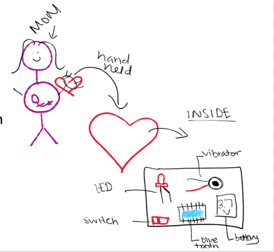
Part 2 PRDs: Led & Vibration
- Device shall be housed in a 4” width heart-shaped (non-anatomical) PLA box
- Device shall contain Bluetooth receiver that shall receive information from the transmitter in the Part 1 circuitry.
- Friendly appearance- red with a smiley face
- Device shall be under $15
- On/off switch shall be located on the external portion of the housing, shall be 0.5”x0.25”, binary, colored red, labeled, and associated with an LED to signal switch status.
- Can fit in a 5”x5”x5” storage container
- Device shall be operated by a rechargeable 3.7V battery pack
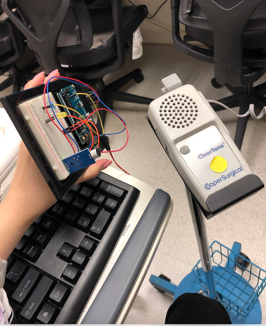
This week in the OB/Gyn department, the focus of my team and I shifted. As we solidified our needs statement and began brainstorming ideas this past week, we really started to refine our concepts. During the lecture on Monday, we learned how to create and use concept cards as a way to communicate our ideas to stakeholders. We performed a beneficial activity where we brainstormed different concepts based on our needs statement:
A method to improve the interaction between the fetus and deaf pregnant individuals that increases maternal involvement in the prenatal experience.
My team and I decided to explore the avenue in which fetal dopplers commonly used in the clinic, and L & D are limited to only audio output. For a patient who is deaf or hard of hearing, this is not ideal as they are unable to hear one of the fundamental milestones of the prenatal experience: the fetal heartbeat. We aim to develop a device, which transmits ultrasound signals of the fetal heartbeat into a visual, audible, and tangible output. Development of concept cards allowed my team and me to break the broader concept in smaller components and ideate from there. Some of the ideas we used the following concepts card template for was:
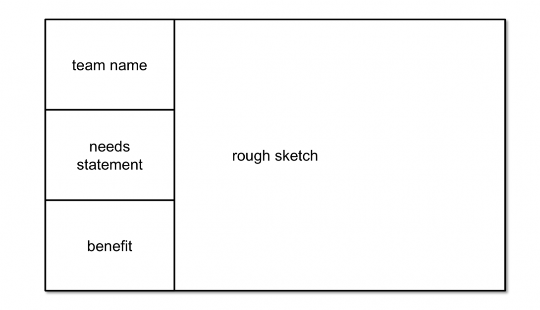
-Method to collect information on heart rate from the Doppler (tap into the circuitry, sound sensors, etc.)
-A handheld component that the patient holds that allows a visual representation of the fetal heartbeat
-A handheld component that the patient holds that allows a tactile representation of the fetal heartbeat
-An app that collects and stores data for the patient to use
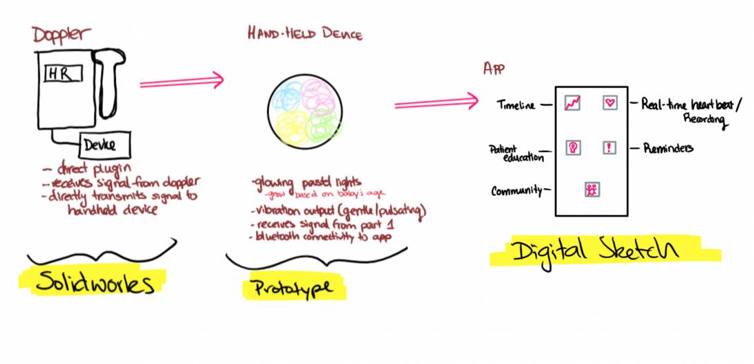
From these cards and speaking with Dr. Ramanathan, we developed more solid ideation of the components of our device. One of the ideas that really benefited from the concept cards was our app. Our original plan was purely a visual display of the heart rate on an app-platform. Through discussing possible benefits of the app, we came up with other ideas:
-A timeline of fetal heart rates that the mother can see and feel outside of the hospital
-Patient education articles to provide information throughout pregnancy progression
-A reminder feature that reminds of appointments, daily prenatal vitamins, etc.
-A community forum that connects other women with similar disabilities, barriers to pregnancy, and questions.
We also had a chance this week to utilize a portable Doppler on ourselves to determine how well our Arduino prototype picks up fetal heart rate sounds. We are looking forward to developing our idea further and presenting this upcoming week!
